Client
OUI OUI
Services
LOGOTYPE DESIGN · CREATIVE DIRECTION · BRAND APPLICATION
Sector
FOOD & BEVERAGE / ARTISANAL ICE CREAM
VISUAL IDENTITY & LOGOTYPE DESIGN
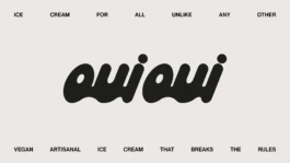
OUI OUI — ICE CREAM UNLIKE ANY OTHER
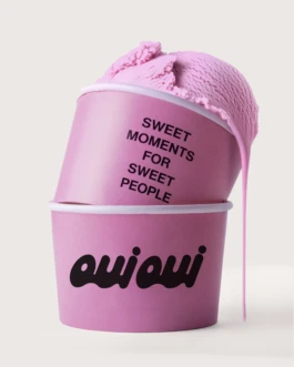
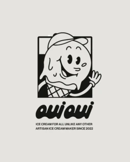
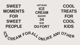
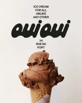
Reinventing the ice cream experience with vegan creations that blend innovation and simplicity. Our challenge was to craft a refined, timeless identity that embodies OUI OUI's core values: authenticity, boldness, and craftsmanship.
Snash is a new generation of healthy and delicious snacks. La Superboite commissioned us to design the new logotype, translating their brand strategy.
We delivered the logotype design based on organic rounded forms. The challenge was to break away from the sanitized codes of the healthy snack industry.
To disrupt this, a diagonal stroke creates a sharp break, serving as a bolt of energy. It reflects the identity: healthy and accessible, yet sharp and unapologetic.
Focus Keyword Intégré: The Artisanal Food Branding project demanded a strong visual response for the logotype.
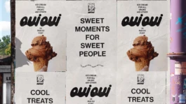
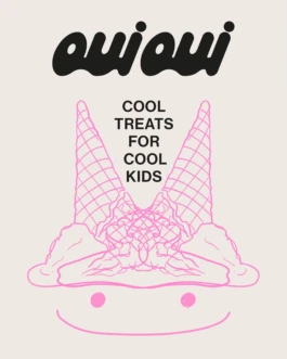
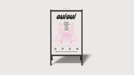
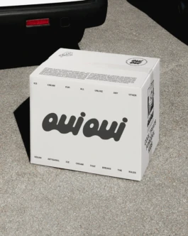
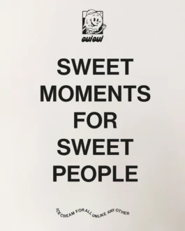
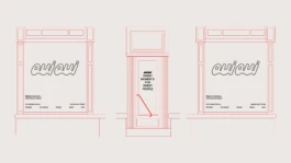
Beyond the logotype, we developed visual applications (packaging mock-ups and explorations). These images serve to contextualize the logo and demonstrate its full potential.
This refined visual approach was strategically engineered to translate effortlessly into premium urban and social media lifestyles, showcasing the brand's potential for high-end market presence.
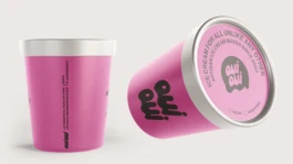

VISUAL IDENTITY & LOGOTYPE DESIGN
OUI OUI — ICE CREAM UNLIKE ANY OTHER
Reinventing the ice cream experience with vegan creations that blend innovation and simplicity. Our challenge was to craft a refined, timeless identity that embodies OUI OUI's core values: authenticity, boldness, and craftsmanship.
Client
OUI OUI
Services
LOGOTYPE DESIGN · CREATIVE DIRECTION · BRAND APPLICATION
Sector
FOOD & BEVERAGE / ARTISANAL ICE CREAM
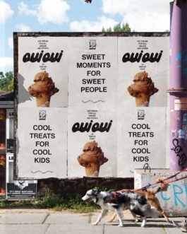
Snash is a new generation of healthy and delicious snacks. La Superboite commissioned us to design the new logotype, translating their brand strategy.
We delivered the logotype design based on organic rounded forms. The challenge was to break away from the sanitized codes of the healthy snack industry.
To disrupt this, a diagonal stroke creates a sharp break, serving as a bolt of energy. It reflects the identity: healthy and accessible, yet sharp and unapologetic.
Focus Keyword Intégré: The Artisanal Food Branding project demanded a strong visual response for the logotype.
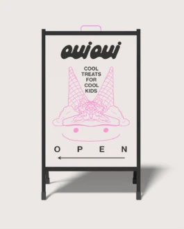
Beyond the logotype, we developed visual applications (packaging mock-ups and explorations). These images serve to contextualize the logo and demonstrate its full potential.
This refined visual approach was strategically engineered to translate effortlessly into premium urban and social media lifestyles, showcasing the brand's potential for high-end market presence.




WE ARE READY TO BEND OVER BACKWARDS TO BRING YOUR PROJECT TO LIFE WITH YOU
RAISE HELL TOGETHERHank studio, 78 rue Américaine, 1050 Brussels · TVA/BTW BE0 768.986.306 · hello@hankstudio.be · +32 (0)494 663 112 · ©HANK STUDIO SNC/ · Terms and conditions of sales · ALL RIGHTS RESERVED 2025
Hank studio, 78 rue Américaine, 1050 Brussels · TVA/BTW BE0 768.986.306 · hello@hankstudio.be · +32 (0)494 663 112 · ©HANK STUDIO SNC/ · Terms and conditions of sales · ALL RIGHTS RESERVED 2025
