• ABOUT
  • WORK
  • ABOUT
  • WORK
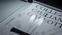
Close-up of the Collezione Giuliano Galeotti catalogue cover, highlighting 3D spot varnish on mineral-inspired patterns. Editorial design by Hank Studio for Galleria Marie-Thérèse Eckelmans Martin.

EDITORIAL, BOOK

CATALOGUE COLLEZIONE GIULIANO GALEOTTI


Giving shape to stone, without freezing it

Context

The Galleria di Marie-Thérèse Eckelmans-Martin, located in Massa Marittima, houses a permanent exhibition dedicated to the Collezione di Giuliano Galeotti, a remarkable collection of minerals gathered over several decades.
Wishing to preserve the integrity of this unique ensemble, Marie-Thérèse acquired it in its entirety and now presents it in a permanent, curated setting.
We were invited to design an editorial object that would accompany and extend this gesture of transmission
.


Challenge

The gallery wanted more than a scientific record. The intention was to create a book that would preserve the unity of the collection while reflecting its emotional weight and visual richness. Rather than listing specimens, the aim was to design a piece that could live within the space of the gallery and resonate with the permanent exhibition. The form and content had to speak the same language.
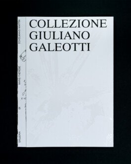
Cover of the Collezione Giuliano Galeotti catalogue, designed by Hank Studio for Galleria Marie-Thérèse Eckelmans Martin. Editorial design with 3D spot varnish highlighting mineral patterns on a white background.
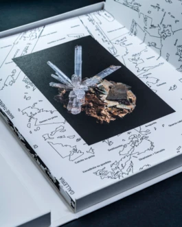
Close-up of the Collezione Giuliano Galeotti catalogue box set, showing the inner cover design with mineral specimen photo and cartographic illustration, editorial design by Hank Studio
Collezione Giuliano Galeotti catalogue inner cover with mineral specimen photo and cartographic illustration, editorial design by Hank Studio

Creative response

We imagined a hybrid object, somewhere between an art book and a catalogue raisonné. The art direction is restrained and elegant, drawing from the language of contemporary publishing and museum design. The layout follows a deliberate rhythm, alternating white space and full-page photographs to highlight the material presence of each specimen. The editorial typeface was chosen and shaped to echo geological layers and crystalline structures, reinforcing the physicality of the subject. Different paper stocks and printing techniques were selected according to the nature of the content, creating subtle shifts in texture and tone throughout the book. The folded cover features a poetic, fictitious map, a subtle nod to mineralogy as an interior landscape, while a spot varnish plays with light to reveal crystalline patterns in relief. The book is housed in a sober, custom-made case, conceived as a protective shell that reinforces its precious, archival quality. We handled the entire process, from concept development to print production, ensuring consistency and quality at every stage.

Collezione Giuliano Galeotti catalogue spread – copper Pantone illustration of minerals with Nanni Moretti quote, editorial design by Hank Studio
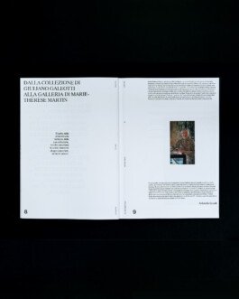
Collezione Giuliano Galeotti catalogue spread – editorial introduction with portrait of Marie-Thérèse Eckelmans-Martin, editorial design by Hank Studio
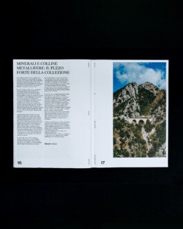
Collezione Giuliano Galeotti catalogue double-page – editorial introduction with landscape photograph, editorial design by Hank Studio for Galleria Marie-Thérèse Eckelmans-Martin
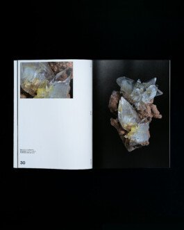
Collezione Giuliano Galeotti catalogue double-page – mineral specimen with close-up detail, editorial design by Hank Studio for Galleria Marie-Thérèse Eckelmans-Martin
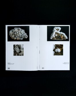
Collezione Giuliano Galeotti catalogue double-page – baryte and calcite on quartz specimens, editorial design by Hank Studio for Galleria Marie-Thérèse Eckelmans-Martin
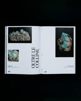
Collezione Giuliano Galeotti catalogue double-page – aquamarine from Pakistan and amazonite with quartz from Colorado, editorial design by Hank Studio
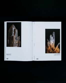
Collezione Giuliano Galeotti catalogue double-page – quartz specimens presented with editorial design by Hank Studio for Galleria Marie-Thérèse Eckelmans-Martin
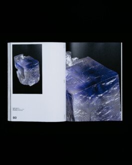
Double-page from the Collezione Giuliano Galeotti catalogue – Salgemma (rock salt mineral) with detail, photographed and designed by Hank Studio
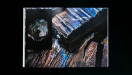
Close-up page from Collezione Giuliano Galeotti catalogue – mineral specimen on black background photographed by Hank Studio
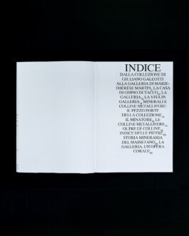
Double-page index of the Collezione Giuliano Galeotti catalogue, designed by Hank Studio in Pantone copper for Galleria Marie-Thérèse Eckelmans-Martin
Acknowledgements page of the Collezione Giuliano Galeotti catalogue, designed by Hank Studio in copper Pantone print for Galleria Marie-Thérèse Eckelmans-Martin

Result

This book was designed as an editorial extension of the Collezione di Giuliano Galeotti, but also as a standalone object that preserves its own presence and rhythm. Displayed within the gallery, it becomes both a memory of the collection and a companion to its exhibition. Thoughtfully printed, carefully constructed, and meant to endure, it reflects a broader gesture, one of preservation, sharing, and quiet admiration.

Client

Galleria di Marie-Thérèse Eckelmans-Martin

Services

Creative Direction

Editorial Design 

Production 

Sector

Mineralogy/Editorial

Close-up of the Collezione Giuliano Galeotti catalogue cover, highlighting 3D spot varnish on mineral-inspired patterns. Editorial design by Hank Studio for Galleria Marie-Thérèse Eckelmans Martin.

EDITORIAL, BOOK

CATALOGUE COLLEZIONE GIULIANO GALEOTTI


GIVING SHAPE TO STONE, WITHOUT FREEZING IT

Context

The Galleria di Marie-Thérèse Eckelmans-Martin, located in Massa Marittima, houses a permanent exhibition dedicated to the Collezione di Giuliano Galeotti, a remarkable collection of minerals gathered over several decades.
Wishing to preserve the integrity of this unique ensemble, Marie-Thérèse acquired it in its entirety and now presents it in a permanent, curated setting.


We were invited to design an editorial object that would accompany and extend this gesture of transmission
.


Challenge

The gallery wanted more than a scientific record. The intention was to create a book that would preserve the unity of the collection while reflecting its emotional weight and visual richness. Rather than listing specimens, the aim was to design a piece that could live within the space of the gallery and resonate with the permanent exhibition. The form and content had to speak the same language.
Cover of the Collezione Giuliano Galeotti catalogue, designed by Hank Studio for Galleria Marie-Thérèse Eckelmans Martin. Editorial design with 3D spot varnish highlighting mineral patterns on a white background.
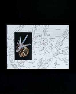
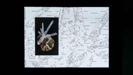
Close-up of the Collezione Giuliano Galeotti catalogue box set, showing the inner cover design with mineral specimen photo and cartographic illustration, editorial design by Hank Studio
Inside cover of the Collezione Giuliano Galeotti catalogue – mineral specimen on map layout designed by Hank Studio for Galleria Marie-Thérèse Eckelmans-Martin

Creative response

We imagined a hybrid object, somewhere between an art book and a catalogue raisonné. The art direction is restrained and elegant, drawing from the language of contemporary publishing and museum design. The layout follows a deliberate rhythm, alternating white space and full-page photographs to highlight the material presence of each specimen. The editorial typeface was chosen and shaped to echo geological layers and crystalline structures, reinforcing the physicality of the subject. Different paper stocks and printing techniques were selected according to the nature of the content, creating subtle shifts in texture and tone throughout the book. The folded cover features a poetic, fictitious map, a subtle nod to mineralogy as an interior landscape, while a spot varnish plays with light to reveal crystalline patterns in relief. The book is housed in a sober, custom-made case, conceived as a protective shell that reinforces its precious, archival quality. We handled the entire process, from concept development to print production, ensuring consistency and quality at every stage.
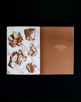
Collezione Giuliano Galeotti catalogue spread – copper Pantone illustration of minerals with Nanni Moretti quote, editorial design by Hank Studio
Collezione Giuliano Galeotti catalogue spread – editorial introduction with portrait of Marie-Thérèse Eckelmans-Martin, editorial design by Hank Studio
Collezione Giuliano Galeotti catalogue spread –by Hank Studio for Marie-Thérèse Eckelmans-Martin Gallery
Collezione Giuliano Galeotti catalogue double-page – baryte and calcite on quartz specimens, editorial design by Hank Studio for Galleria Marie-Thérèse Eckelmans-Martin
Collezione Giuliano Galeotti catalogue double-page – aquamarine from Pakistan and amazonite with quartz from Colorado, editorial design by Hank Studio
Collezione Giuliano Galeotti catalogue double-page – quartz specimens presented with editorial design by Hank Studio for Galleria Marie-Thérèse Eckelmans-Martin
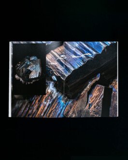
Double-page from the Collezione Giuliano Galeotti catalogue – Salgemma (rock salt mineral) with detail, photographed and designed by Hank Studio
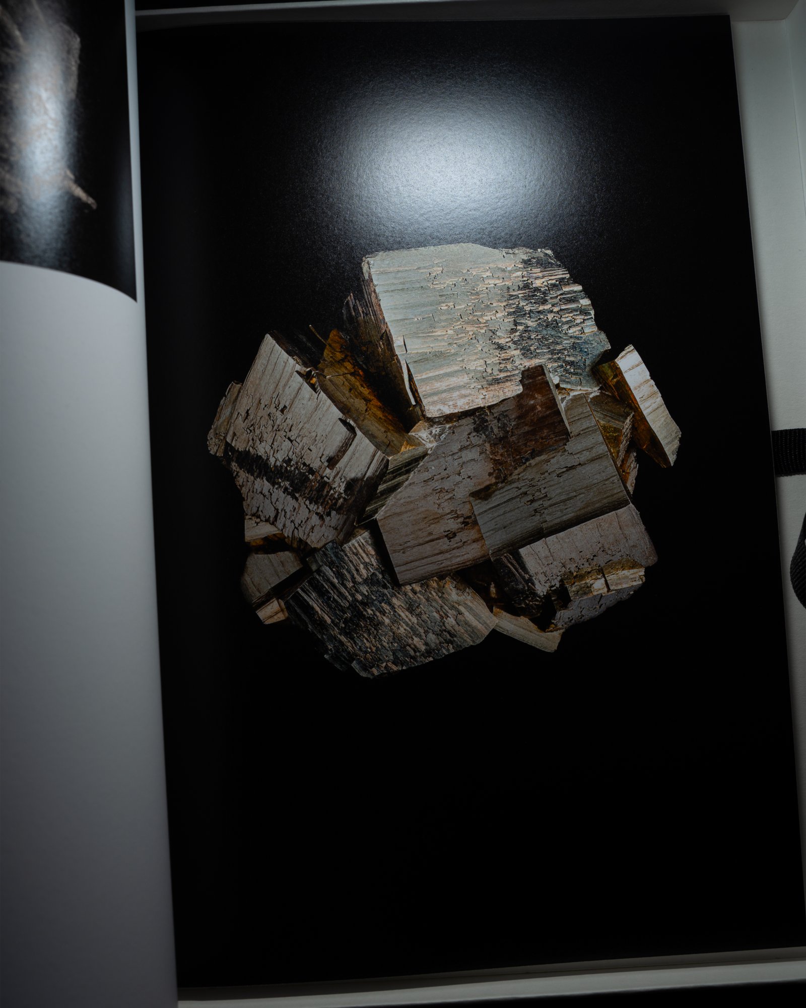
Close-up page from Collezione Giuliano Galeotti catalogue – mineral specimen on black background photographed by Hank Studio
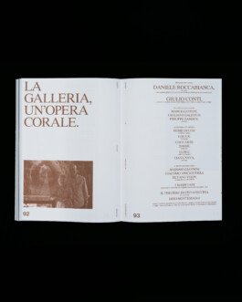
Double-page index of the Collezione Giuliano Galeotti catalogue, designed by Hank Studio in Pantone copper for Galleria Marie-Thérèse Eckelmans-Martin
Acknowledgements page of the Collezione Giuliano Galeotti catalogue, designed by Hank Studio in copper Pantone print for Galleria Marie-Thérèse Eckelmans-Martin

Result

This book was designed as an editorial extension of the Collezione di Giuliano Galeotti, but also as a standalone object that preserves its own presence and rhythm. Displayed within the gallery, it becomes both a memory of the collection and a companion to its exhibition. Thoughtfully printed, carefully constructed, and meant to endure, it reflects a broader gesture, one of preservation, sharing, and quiet admiration.

Client

Galleria di Marie-Thérèse Eckelmans-Martin

Services

Creative Direction

Editorial Design 

Production 

Sector

Mineralogy/Editorial

Hank bending illustration

WE ARE READY TO BEND OVER BACKWARDS TO BRING YOUR PROJECT TO LIFE WITH YOU

RAISE HELL TOGETHER
FOLLOW US ON INSTAGRAM
SNASH
Snash Energy Bars Packaging in motion HANK STUDIO
Hank Brussels For Bath and Good
Artistic Instagram visual of Hank Brussels’ Son of a Beach soap with layered ocean textures and a human silhouette in a tiled blue bathroom. HANK STUDIO
branding, art direction, visual identity, graphic design and more by Hank Studio. Born in Brussels, since 2021.

Hank studio, 78 rue Américaine, 1050 Brussels · TVA/BTW BE0 768.986.306 · hello@hankstudio.be · +32 (0)494 663 112 · ©HANK STUDIO SNC/ · Terms and conditions of sales · ALL RIGHTS RESERVED 2025

Hank bending illustration

RAISE HELL TOGETHER
FOLLOW US ON INSTAGRAM
BANANA BOAT GET LIFTED
White ashtray with red Banana Boat logo and illustrated banana mascot holding a cigarette, designed by Hank Studio. HANK STUDIO
VITÆVINO WINE CULTURE AND CONVIVIALITY
Event pass design for Vitaevino campaign 2024/25 with bold red typography and slogan “Support the Campaign – Defend Wine Culture and Conviviality.” HANK STUDIO
branding, art direction, visual identity, graphic design and more by Hank Studio. Born in Brussels, since 2021.

Hank studio, 78 rue Américaine, 1050 Brussels · TVA/BTW BE0 768.986.306 · hello@hankstudio.be · +32 (0)494 663 112 · ©HANK STUDIO SNC/ · Terms and conditions of sales · ALL RIGHTS RESERVED 2025