Client
LA SUPERBOITE (for SNASH)
Services
LOGOTYPE DESIGN · CREATIVE DIRECTION · BRAND APPLICATION
Sector
FOOD & BEVERAGE / HEALTHY SNACKING
VISUAL IDENTITY & LOGOTYPE DESIGN
SNASH ENERGY BALLS — Healthy doesn’t have to be boring
Translating the energy and boldness of a plant-based snack into a logotype that injects life into a healthy snack industry stuck in conformism.
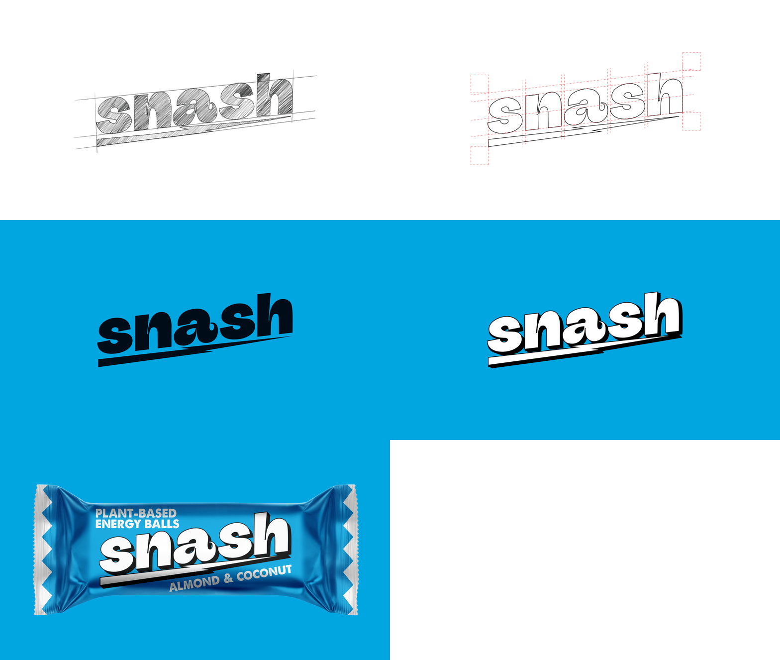
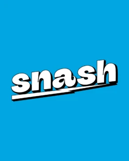
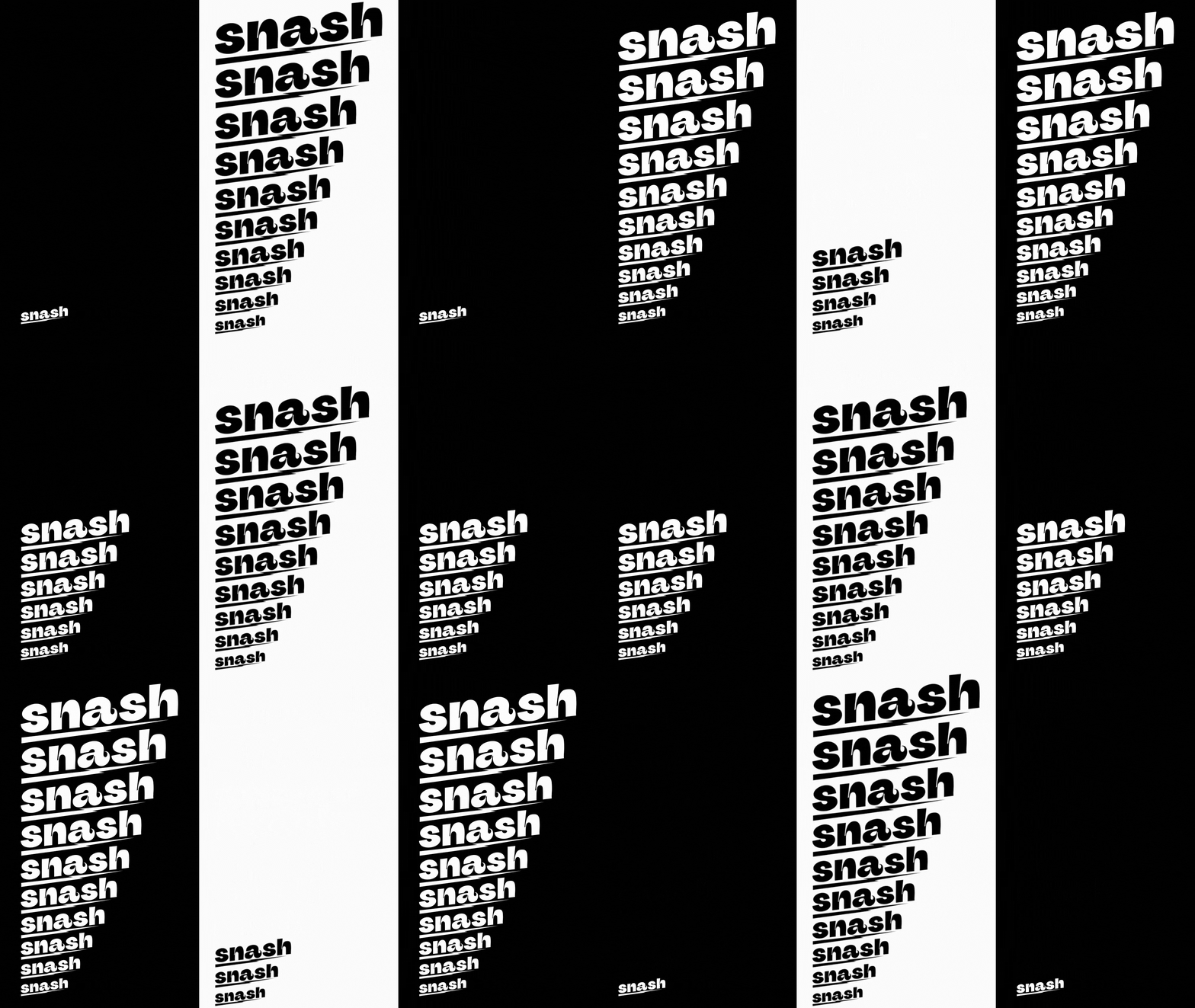
Snash is a new generation of healthy and delicious snacks. As part of its rebranding, La Superboite agency commissioned us to design the new logotype, translating their brand strategy. We delivered the logotype design based on organic rounded forms.
The challenge was to break away from the sanitized codes of the healthy snack industry, while remaining true to Snash's accessible and energetic personality.
The logo had to remain simple, friendly, and instantly recognizable. To disrupt this, a diagonal stroke creates a sharp break, serving as a bolt of energy. It reflects the identity: healthy and accessible, yet sharp and unapologetic.
The Healthy Snack Branding project demanded a strong visual response for the logotype.
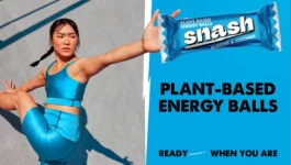
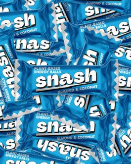
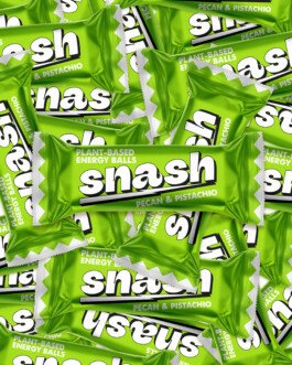
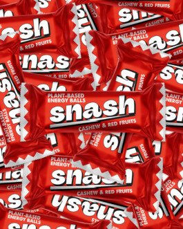
Beyond the logotype, we developed visual applications (packaging mock-ups, explorations). These images serve to contextualize the logo and demonstrate its full potential.
These proposals demonstrate how the logotype adapts effortlessly while asserting Snash's vibrant voice in the healthy snack market.
VISUAL IDENTITY & LOGOTYPE DESIGN
SNASH ENERGY BALLS — Healthy doesn’t have to be boring
Translating the energy and boldness of a plant-based snack into a logotype that injects life into a healthy snack industry stuck in conformism.
Client
LA SUPERBOITE (for SNASH)
Services
LOGOTYPE DESIGN · CREATIVE DIRECTION · BRAND APPLICATION
Sector
FOOD & BEVERAGE / HEALTHY SNACKING

Snash is a new generation of healthy and delicious snacks. As part of its rebranding, La Superboite agency commissioned us to design the new logotype, translating their brand strategy. We delivered the logotype design based on organic rounded forms.
The challenge was to break away from the sanitized codes of the healthy snack industry, while remaining true to Snash's accessible and energetic personality.
The logo had to remain simple, friendly, and instantly recognizable. To disrupt this, a diagonal stroke creates a sharp break, serving as a bolt of energy. It reflects the identity: healthy and accessible, yet sharp and unapologetic.
The Healthy Snack Branding project demanded a strong visual response for the logotype.
Beyond the logotype, we developed visual applications (packaging mock-ups, explorations). These images serve to contextualize the logo and demonstrate its full potential.
These proposals demonstrate how the logotype adapts effortlessly while asserting Snash's vibrant voice in the healthy snack market.


WE ARE READY TO BEND OVER BACKWARDS TO BRING YOUR PROJECT TO LIFE WITH YOU
RAISE HELL TOGETHERHank studio, 78 rue Américaine, 1050 Brussels · TVA/BTW BE0 768.986.306 · hello@hankstudio.be · +32 (0)494 663 112 · ©HANK STUDIO SNC/ · Terms and conditions of sales · ALL RIGHTS RESERVED 2025
Hank studio, 78 rue Américaine, 1050 Brussels · TVA/BTW BE0 768.986.306 · hello@hankstudio.be · +32 (0)494 663 112 · ©HANK STUDIO SNC/ · Terms and conditions of sales · ALL RIGHTS RESERVED 2025


