BRANDING
LES TABLES DE JOSÉPHINE
A REFINED UNIVERSE TO ELEVATE THE ART OF THE TABLE STYLING
Les Tables de Joséphine is a styling and ambiance design studio that redefines table decoration through unique and immersive experiences. Blending sophistication with adventure, the brand caters to a clientele seeking elegance and originality. When Joséphine approached us, she wanted a strong, memorable visual identity that reflected both her passion for table styling and her commitment to responsible consumption.

Our approach embraced the brand’s duality, balancing classic and contemporary, opulence and simplicity, refinement and conviviality. Inspired by haute couture and Mediterranean aesthetics, the visual identity features a vibrant palette reminiscent of travel and craftsmanship, setting the brand apart with a warm yet bold presence.

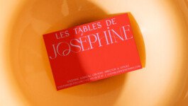
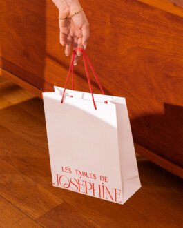
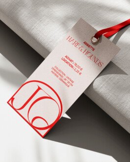
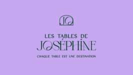
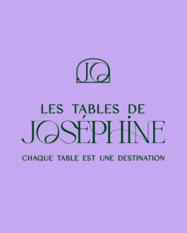
The logo embodies this essence: a sophisticated typeface merging classic and modern influences, reminiscent of couture houses and fine dining prestige. The emblem, a monogram of “JO” within a Mediterranean inspired cartouche, serves as a strong, recognizable signature, ensuring a cohesive and refined visual identity.
Les Tables de Joséphine’s brand voice is bold, sophisticated, and subtly subversive, infused with British wit. This approach fosters a deeper connection with its audience appealing to those who seek both quality and a compelling aesthetic and invites them into a world where every detail is meticulously curated.
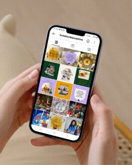
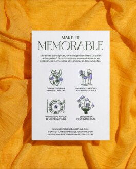
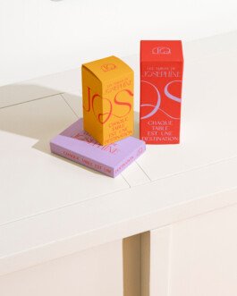
Beyond the logo and colors, the brand identity extends to every touchpoint. Packaging plays with textures and colors to reflect its elegance, while labels and printed materials feature haute couture inspired finishes. The storefront and signage immediately immerse customers in a refined, inspiring atmosphere. Every asset strengthens the brand’s presence and storytelling.
This strategy ensures a cohesive, immersive identity aligned with Joséphine’s vision. More than a visual concept, it’s a living experience that evolves with its audience.
Client
Les Tables de Joséphine
Services
Art direction
Graphic Design
Branding
Sector
Tableware & Event Table Decoration
BRANDING
LES TABLES DE JOSÉPHINE
REFINED UNIVERSE TO ELEVATE THE ART OF TABLE STYLING
Les Tables de Joséphine is a styling and ambiance design studio that redefines table decoration through unique and immersive experiences. Blending sophistication with adventure, the brand caters to a clientele seeking elegance and originality. When Joséphine approached us, she wanted a strong, memorable visual identity that reflected both her passion for table styling and her commitment to responsible consumption.

Our approach embraced the brand’s duality—balancing classic and contemporary, opulence and simplicity, refinement and conviviality. Inspired by haute couture and Mediterranean aesthetics, the visual identity features a vibrant palette reminiscent of travel and craftsmanship, setting the brand apart with a warm yet bold presence.


The logo embodies this essence: a sophisticated typeface merging classic and modern influences, reminiscent of couture houses and fine dining prestige. The emblem, a monogram of “JO” within a Mediterranean inspired cartouche, serves as a strong, recognizable signature, ensuring a cohesive and refined visual identity.
Les Tables de Joséphine’s brand voice is bold, sophisticated, and subtly subversive, infused with British wit. This approach fosters a deeper connection with its audience appealing to those who seek both quality and a compelling aesthetic and invites them into a world where every detail is meticulously curated.


Beyond the logo and colors, the brand identity extends to every touchpoint. Packaging plays with textures and colors to reflect its elegance, while labels and printed materials feature haute couture-inspired finishes. The storefront and signage immediately immerse customers in a refined, inspiring atmosphere. Every asset strengthens the brand’s presence and storytelling.
This strategy ensures a cohesive, immersive identity aligned with Joséphine’s vision. More than a visual concept, it’s a living experience that evolves with its audience.
Client
Les Tables de Joséphine
Services
Art direction
Graphic Design
Branding
Sector
Tableware & Event Table Decoration
WE ARE READY TO BEND OVER BACKWARDS TO BRING YOUR PROJECT TO LIFE WITH YOU
RAISE HELL TOGETHERHank studio, 78 rue Américaine, 1050 Brussels · TVA/BTW BE0 768.986.306 · hello@hankstudio.be · +32 (0)494 663 112 · ©HANK STUDIO SNC/ · Terms and conditions of sales · ALL RIGHTS RESERVED 2025
Hank studio, 78 rue Américaine, 1050 Brussels · TVA/BTW BE0 768.986.306 · hello@hankstudio.be · +32 (0)494 663 112 · ©HANK STUDIO SNC/ · Terms and conditions of sales · ALL RIGHTS RESERVED 2025
